
10 Minute English
Work on an existing English‑learning app close to Bright in its product model: 20+ locales, iOS/Android.
Product Context
10 Minute English is an English‑learning app that is close to Bright in its product logic: short daily sessions, vocabulary growth, word repetition, and a steady return to already learned material.
When I joined the product, the app already existed. Changes had to fit into a live system: 20+ locales, iOS and Android, existing navigation, subscription logic, analytics, content infrastructure, and current user habits.
Feature 1. Books
Books grew step by step: an MVP with catalog, reading, and book vocabulary; access and upsell; then comfortable reading UX with audio and settings.
Hypothesis: if adapted books are integrated into the familiar 10 Minute English mechanics, reading can become a new subscription motivator and give vocabulary real context.
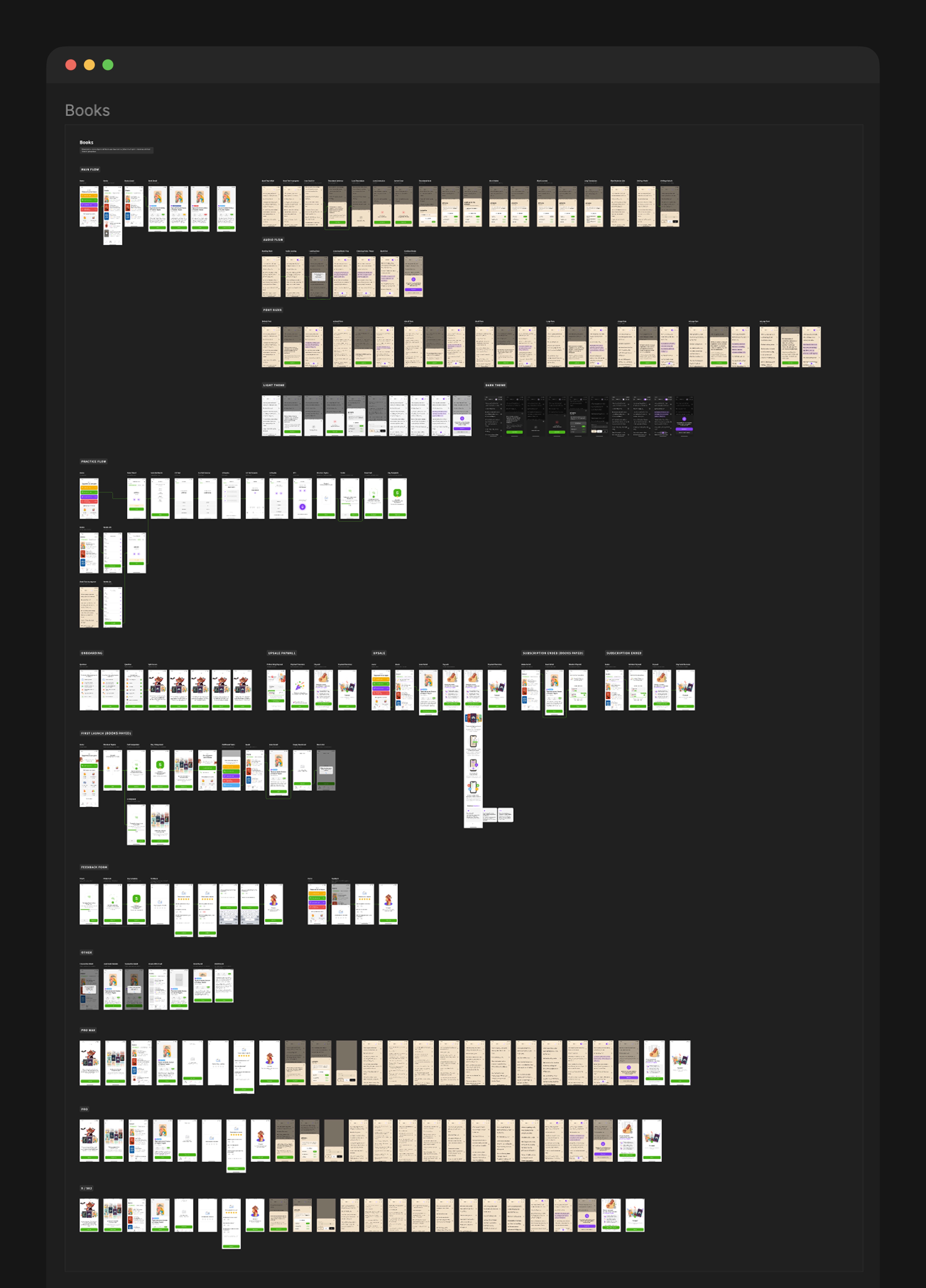
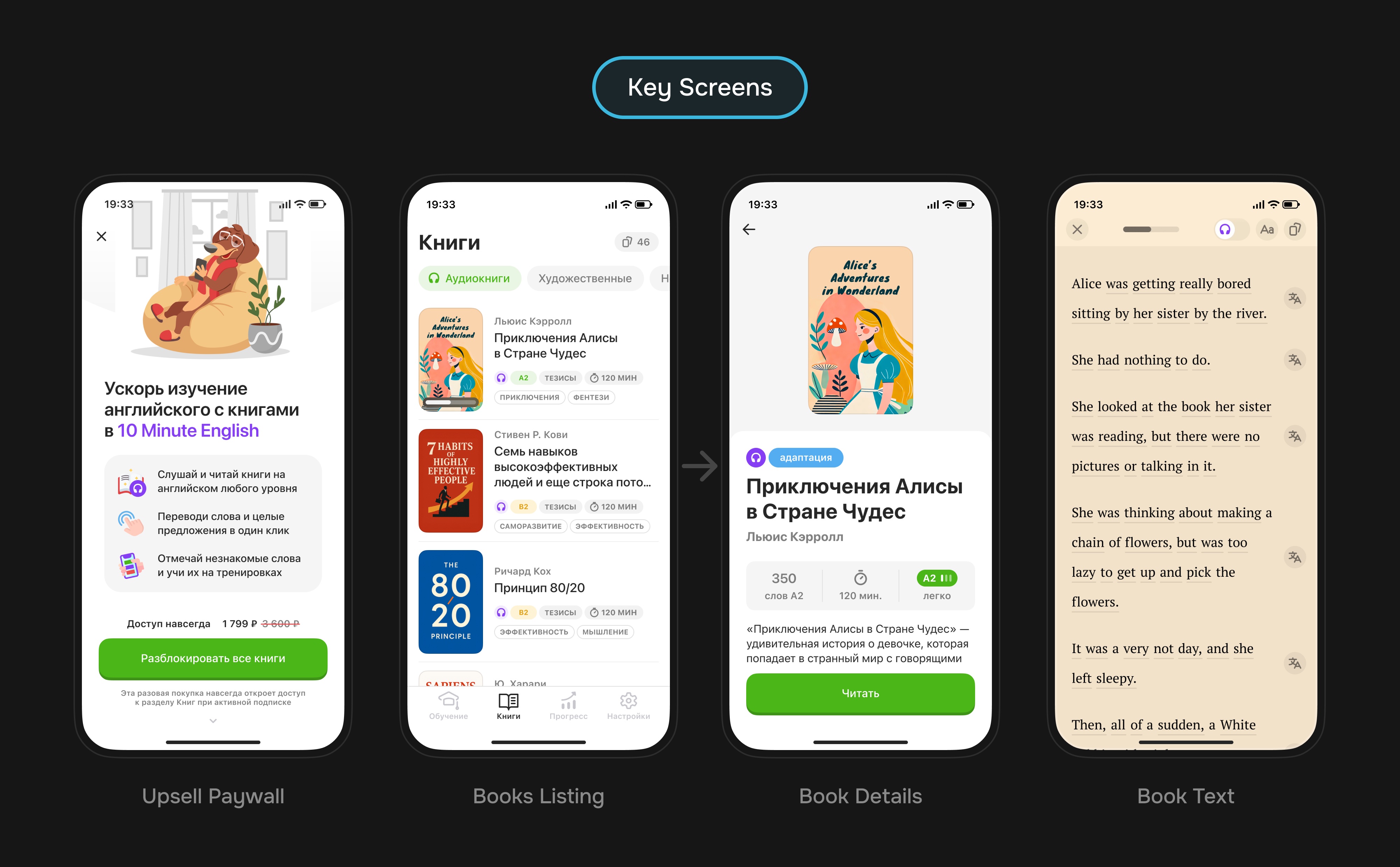
Iteration 1. MVP: From Catalog to Reading
The first pass assembled the feature skeleton: bottom navigation entry, catalog, book details, reading, word translation, saving, and practice from book vocabulary.
| Part | How It Worked | Why |
|---|---|---|
| Entry | A dedicated Books tab in the bottom navigation | Make the new value visible without rebuilding the whole navigation |
| Catalog | A book list with type, level, duration, genres, and reading progress | Help users quickly pick a book for their current level |
| Book details | Cover, description, word count, estimated time, level, and a continue action | Give enough context before a longer action |
| Reading | A basic text screen with translation, progress, and saved words | Validate that reading connects to learning instead of living separately |
| Practice | A list of book words and a workout entry for that material | Bring new words back into the core repetition loop |
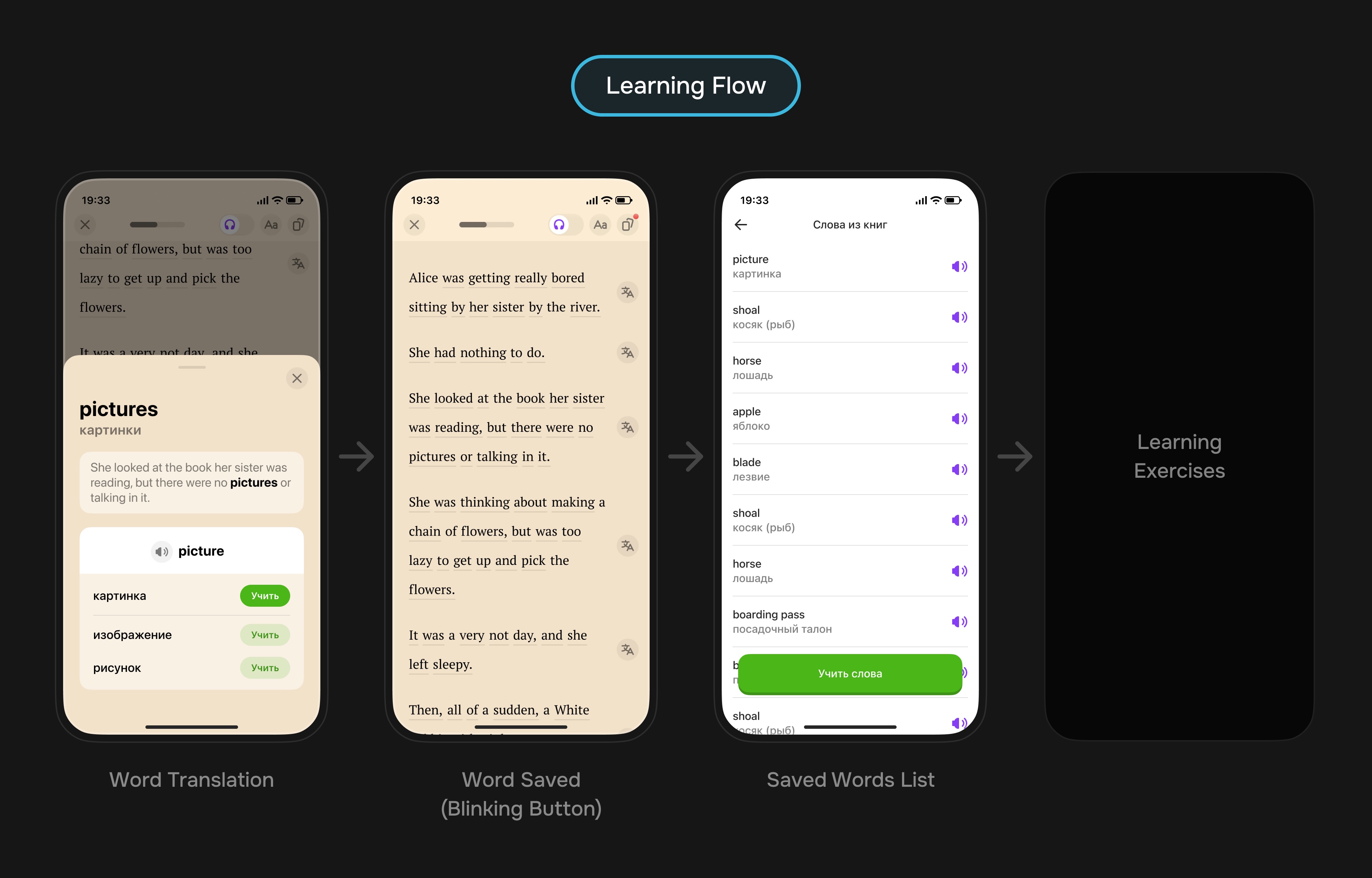
MVP outcome: the team got an end‑to‑end prototype where users choose a book, read, translate words, save them, and return to practice.
Iteration 2. Access, Upsell, and First Launch
In the second iteration, Books was packaged as subscription value: promo screen, upsell, first launch, and states for users with and without access. The upsell appeared here; later it was refined once for audiobooks.
- For users without access, the section worked as a value preview rather than an empty locked tab.
- The upsell explained the purchase: reading, books, and the connected learning scenario.
- The first launch explained why books appeared and how they connected to learning.
Outcome: Books got a clear launch frame and became a separate argument for subscription value.
Iteration 3. Books UX: Reading, Audio, and Settings
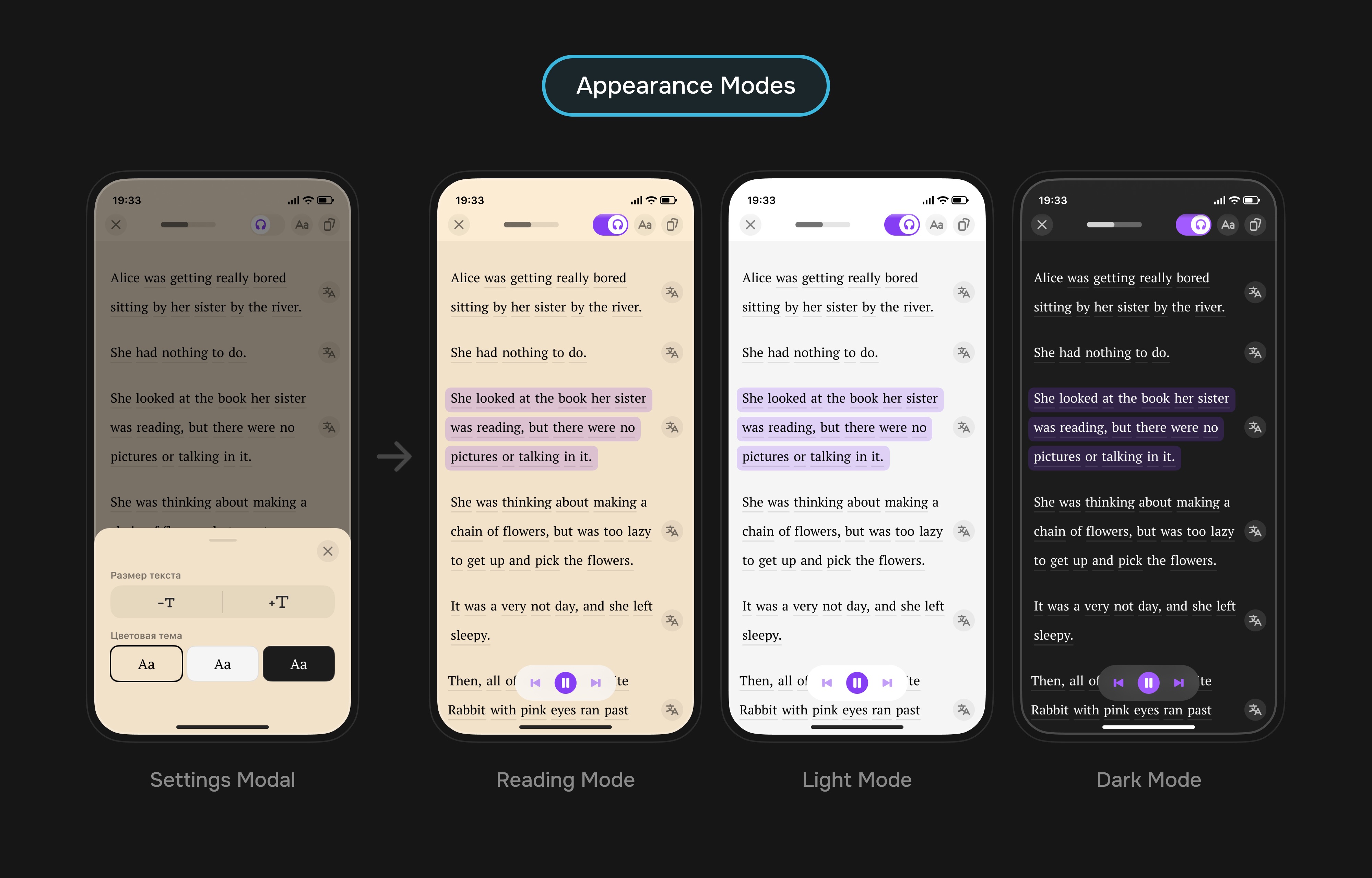
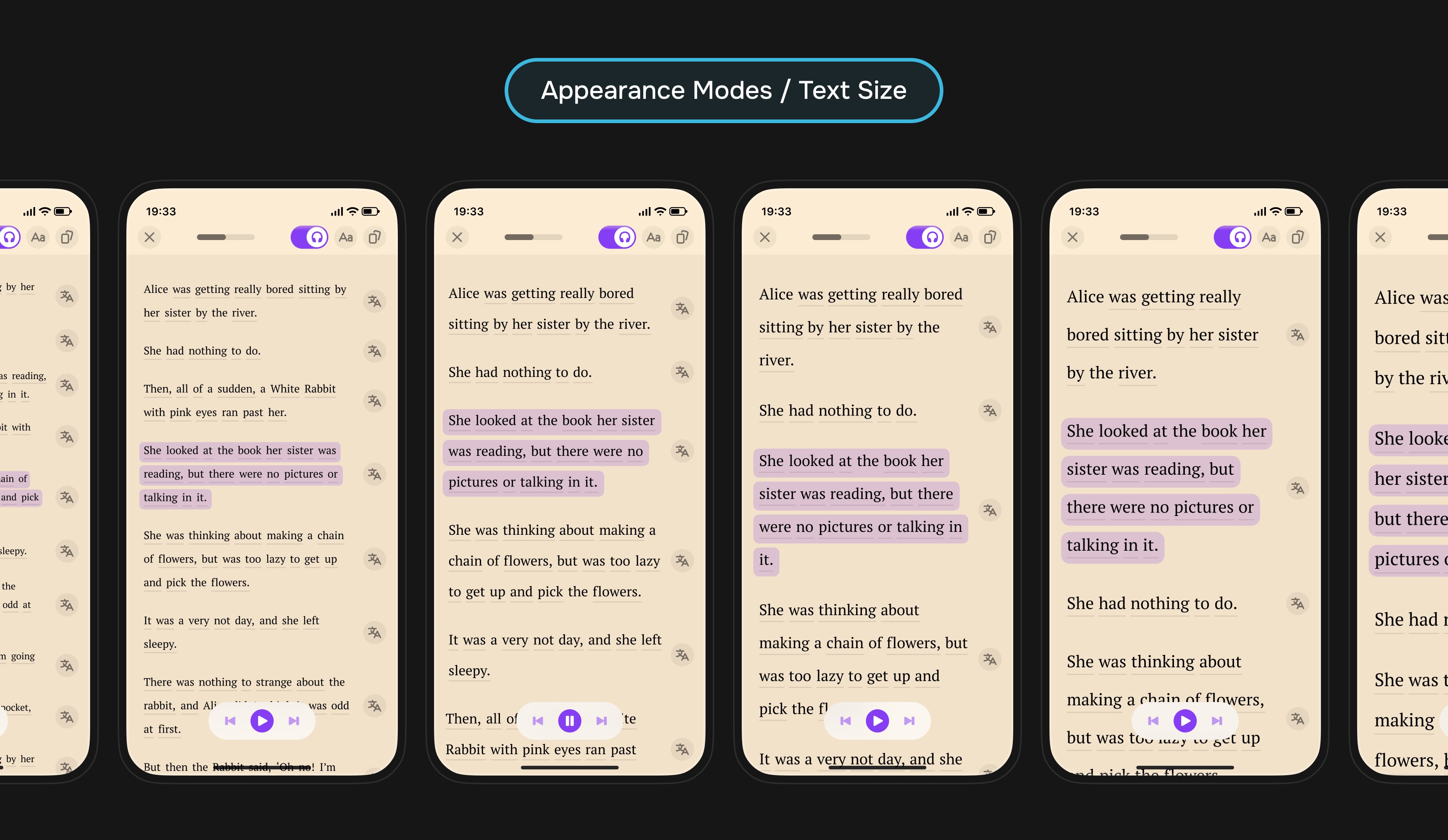
The third iteration turned the basic reading screen into a full learning environment. The focus moved from simply providing content to making the process comfortable: audiobooks, text settings, quick sentence translations, and a link between reading, listening, and saved words.
Users could switch between reading and audio without losing context, and the section became clearer for people who wanted to work with text, not just learn isolated words.
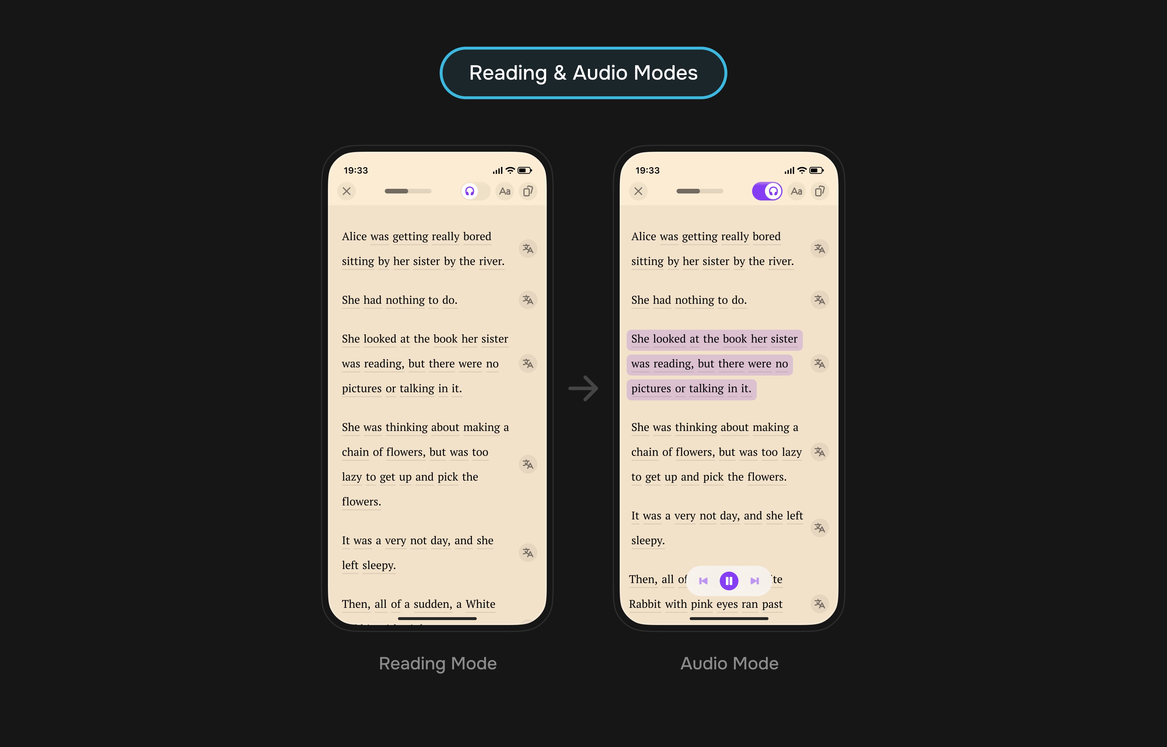
Outcome: Books became closer to a learning flow, not just a library inside the app.
Books Outcome
The main point was not a text screen, but new product value: access, catalog, comfortable reading, saved words, and a connection to practice.
The baseline launch confirmed interest in reading and book vocabulary. Segmentation added nuance: advanced users read more actively, but they were a small segment; scale depended on engaging beginners, simpler A2 books, and softer access. The upsell could be monetized separately, but only without the feeling of a surprise charge.
Feature 2. Perfect Streak
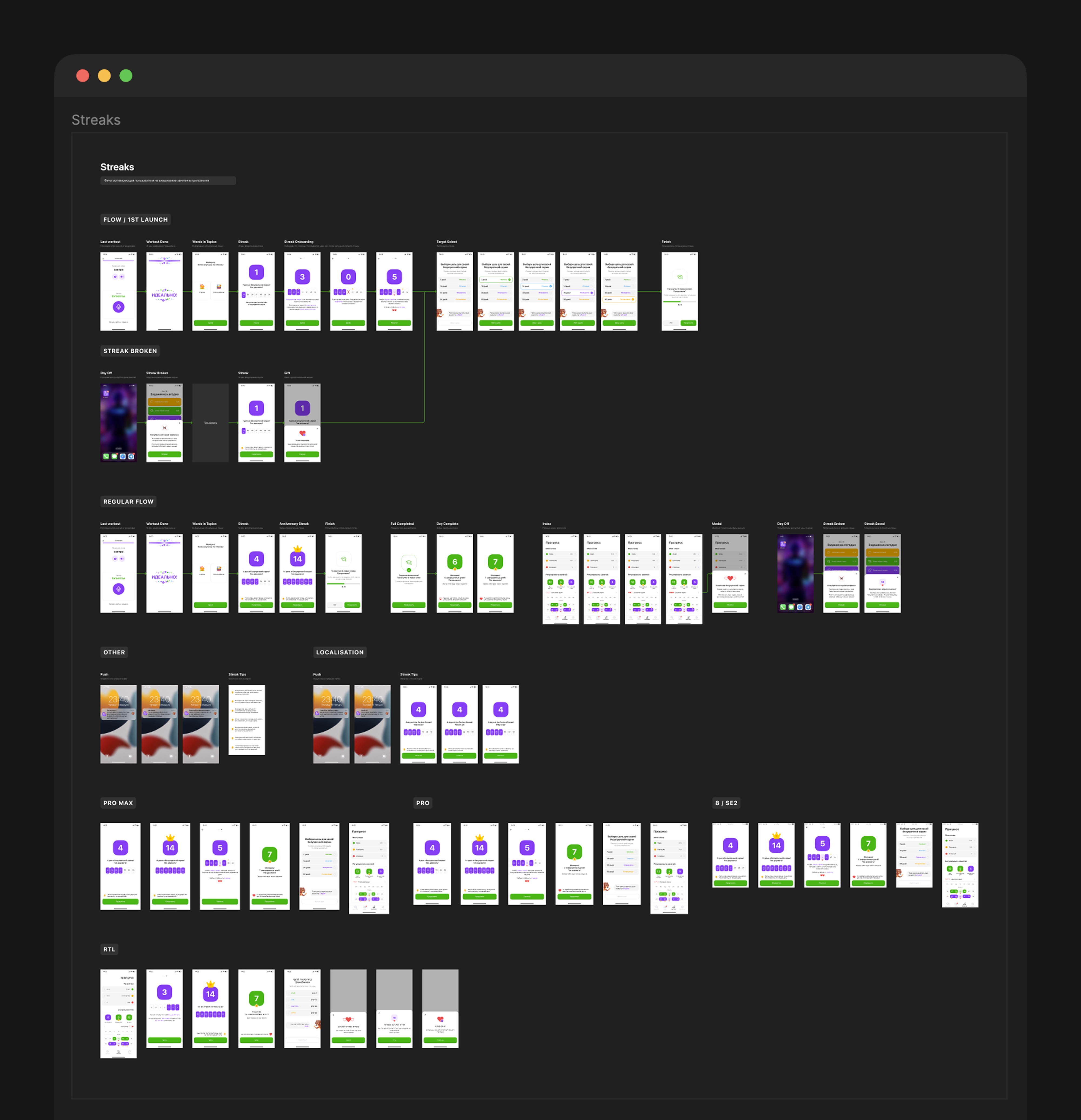
Perfect Streak appeared in three steps: a base counter with progress and calendar, then lives for recovery, then goal selection and anniversary days.
Hypothesis: if daily consistency becomes visible and users get a softer way to save progress, consistency will become clearer and subscription value more visible.
Iteration 1. Base Streak, Progress, and Calendar
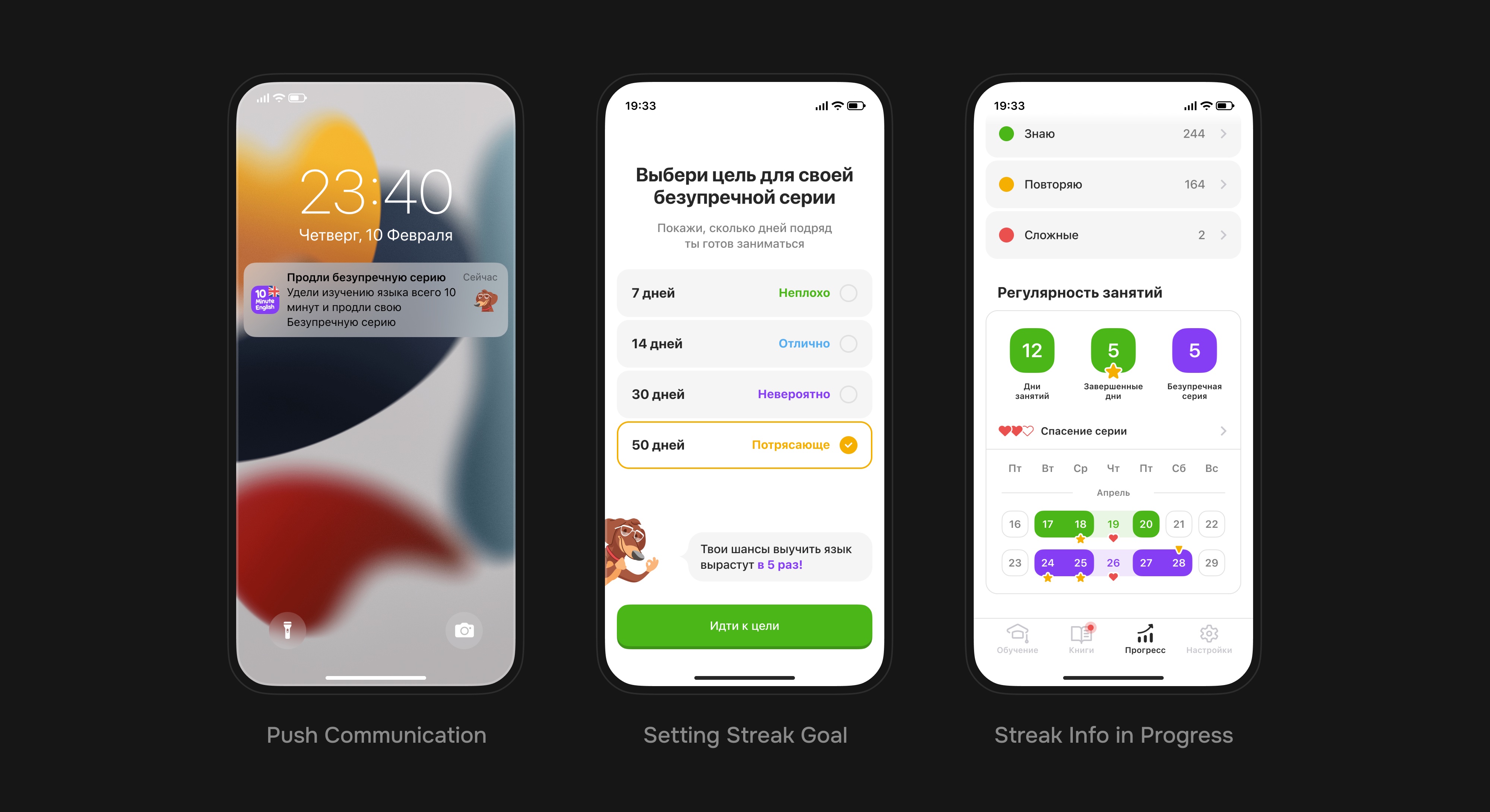
The first iteration launched consistency without lives or goals: explanation after a workout, first streak day, daily result, progress, and calendar.
| Part | How It Worked | Why |
|---|---|---|
| Entry | After a workout, users saw an explanation of the new mechanic and received the first streak day | Introduce the mechanic after the user had already completed a valuable action |
| Daily result | Showed the current streak day, weekly calendar, and a cue to return tomorrow | Make consistency visible inside the daily loop |
| Progress and calendar | Lesson counters, completed days, streak status, and the calendar lived in the progress section | Show that the streak did not disappear after one result and was connected to broader progress |
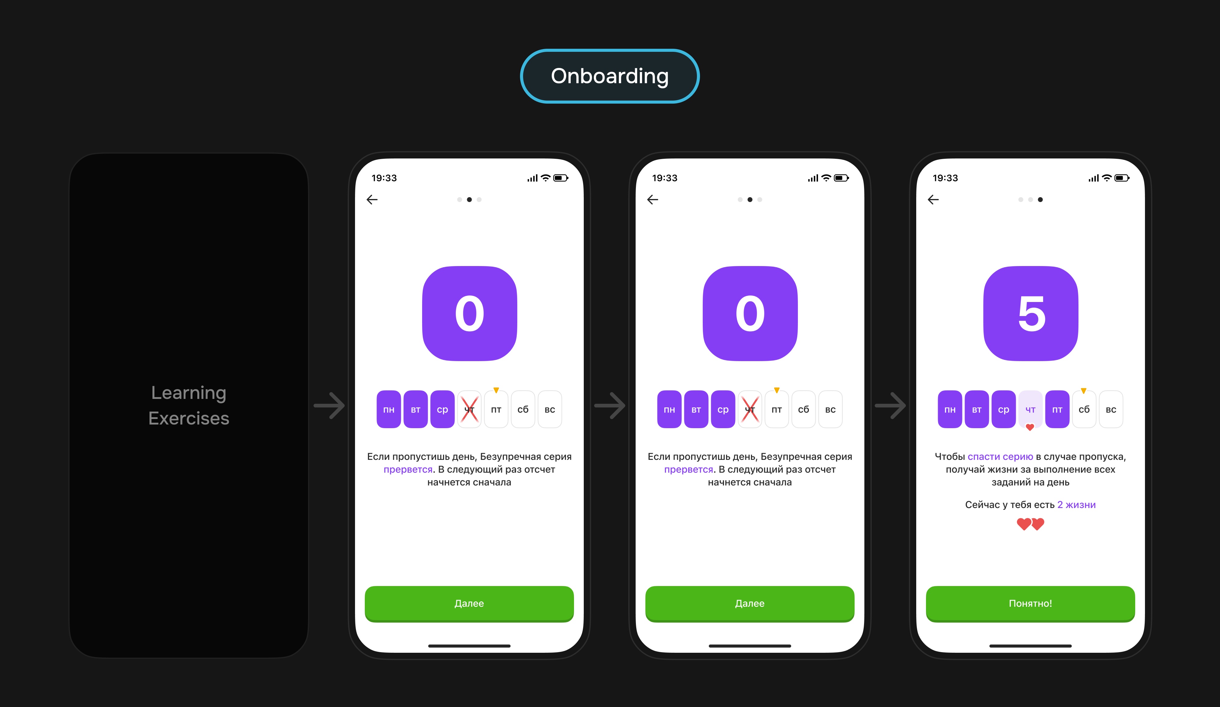
| Missed‑day rule | Dedicated screens explained that a missed day would break the streak | Reduce the risk of an unpleasant surprise after the first missed day |
Result: the streak got a clear start. Users saw the new counter, understood what made it grow, could check the calendar, and learned the missed‑day rule upfront.
Iteration 2. Lives and Streak Recovery
In the second iteration, we added lives: if users missed a day, the streak did not always reset — it could be saved, and new lives were earned by completing all daily tasks.
- A missed day became a managed scenario, not a sudden punishment.
- Lives connected recovery to completing all daily tasks.
- The calendar gained saved days and current streak status.
Outcome: motivation became less fragile while the value of daily consistency stayed clear.
Iteration 3. Streak Goal and Anniversary Days
The third iteration added goal selection and anniversary days. Users chose a target, while milestone days received a dedicated celebration.
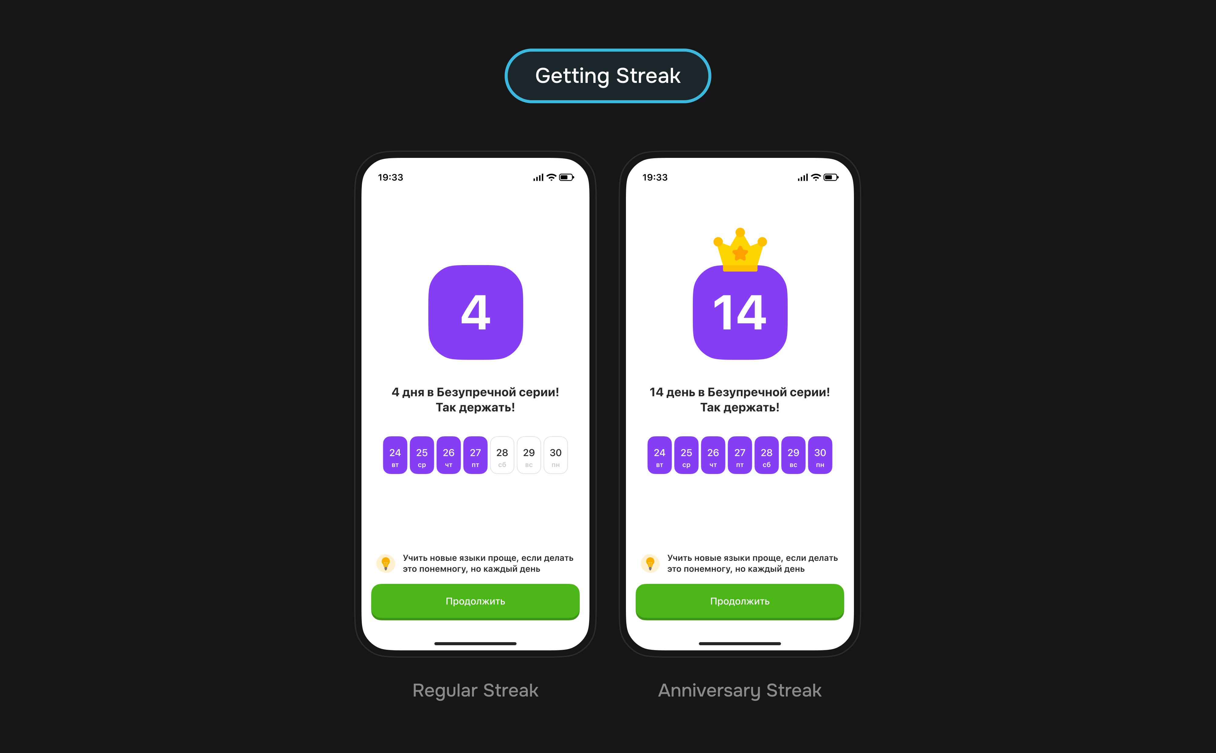
The outcome was mixed: ARPU increased, but the goal‑selection screen added friction to the daily flow.
The hypothesis behind the lower day completion: goal selection created an extra step at the moment users wanted to finish the daily loop. For some users it strengthened commitment, but for advanced users and people under higher load it could feel like extra pressure.
Perfect Streak Outcome
In the end, the streak became a motivation system around daily learning: result, calendar, lives, goal, anniversary days, pushes, and a clear missed‑day flow.
The base version statistically strengthened consistency, lives extended streak length, and goals showed a financial lift at the cost of behavioral friction. This reinforced the segment takeaway: motivational layers work best when they support the mass user instead of adding pressure for stronger learners.
Feature 3. Training Streaks
Training Streaks increased motivation inside the exercise: consecutive correct answers grew a counter, changed progress, and created a short challenge loop.
Hypothesis: if a correct‑answer streak is shown during the workout, repetitive exercises will feel livelier and harder to abandon.
What Was Built
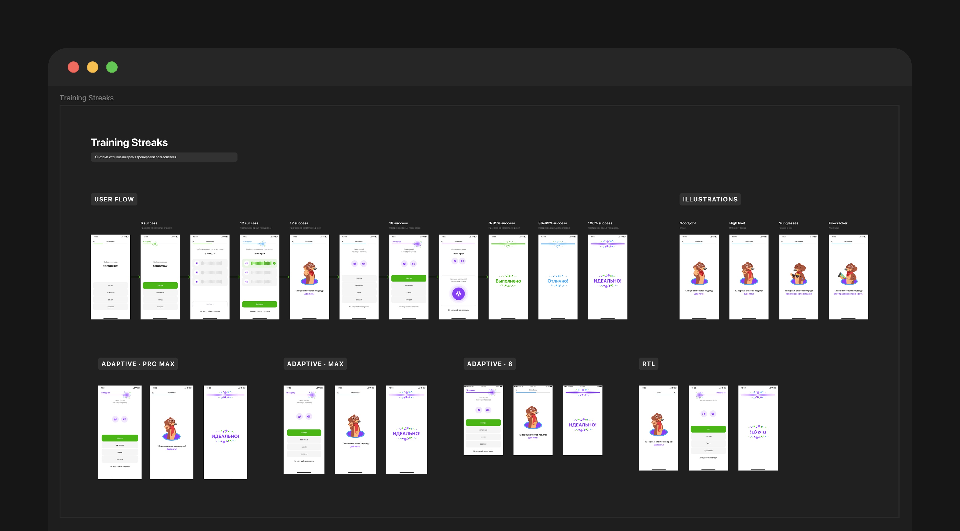
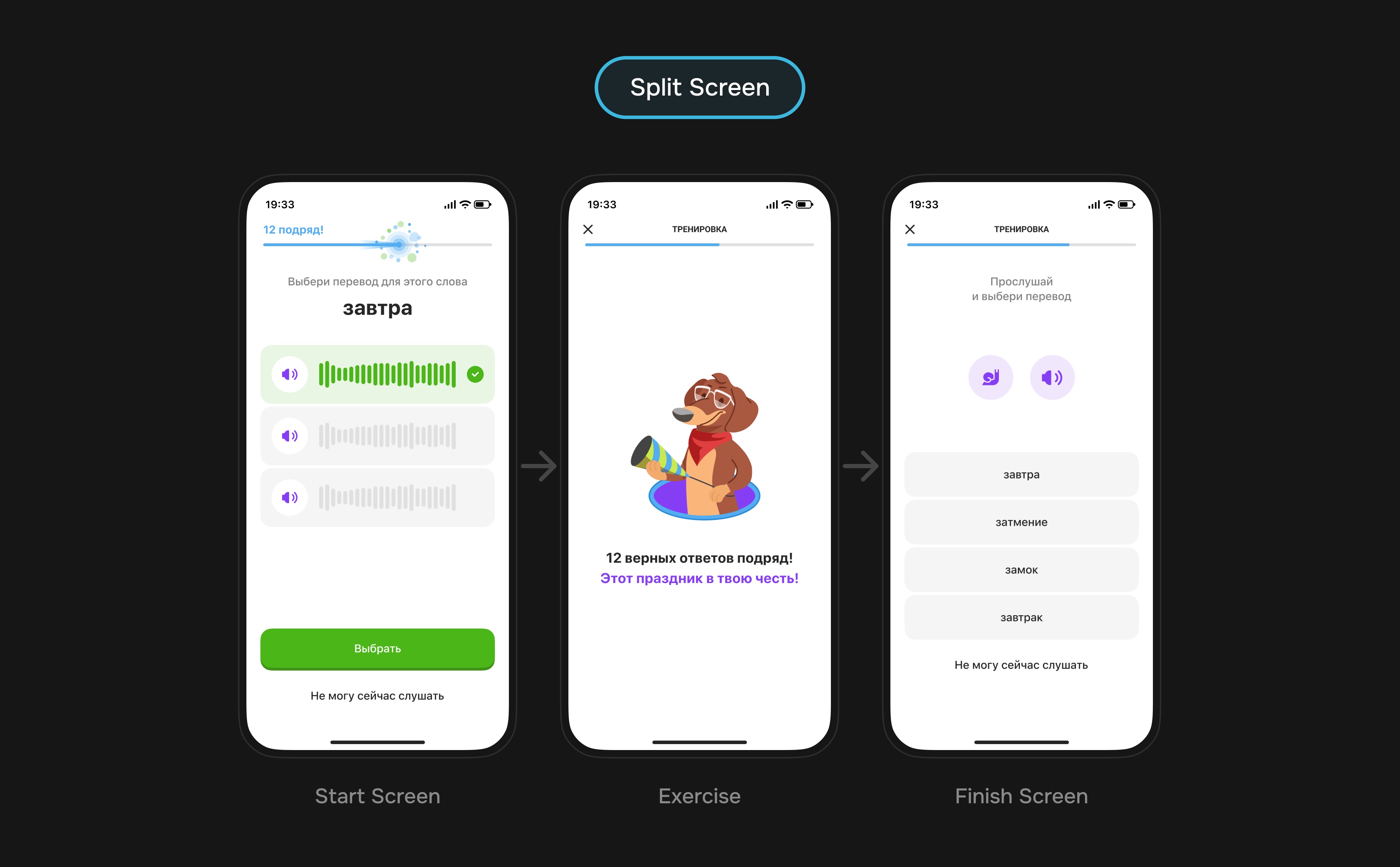
The feature was built into the existing workout without a separate mode. The counter grew after correct answers, the progress bar changed state, and a strong streak triggered visible praise.
| Element | How It Worked | Why |
|---|---|---|
| Counter | Showed the number of correct answers in a row during the exercise | Make progress visible before the final screen |
| Progress | Color and a short effect changed as the streak grew | Create a sense of increasing value without adding a new control mechanic |
| Final praise | The result screen depended on streak strength and workout success | Create emotional payoff without complicating the workout |
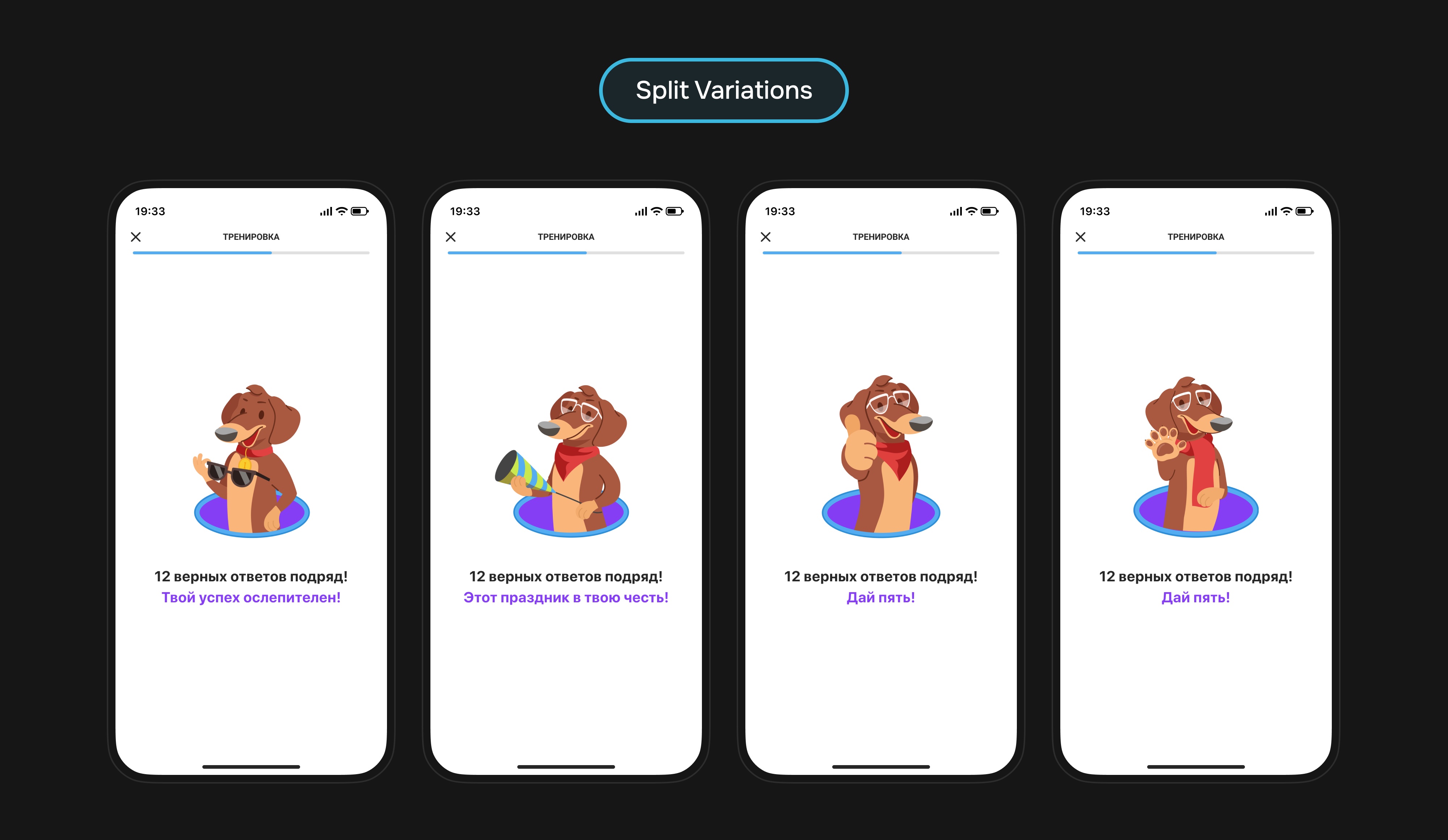
Results
The feature did not require new behavior: it strengthened the same workout flow. In the first test, we observed a positive financial trend, while v1.1 statistically reduced new‑word workout cancellations and increased total workout volume.
The v1.1 takeaway: the feature barely affected repetition, but it clearly kept users inside new‑word workouts. Segmentation was again more useful than the average metric: beginners contributed better financial lift, while advanced users dropped 10.1% in subscription conversion without statistical confidence.
Feature 4. Word Repetition
Word Repetition was an attempt to update a core workout: instead of calmly going through words one by one, we tested matching pairs, a timer, progress, and several result levels.
Hypothesis: a short matching challenge with a timer would make repetition less monotonous and improve retention.
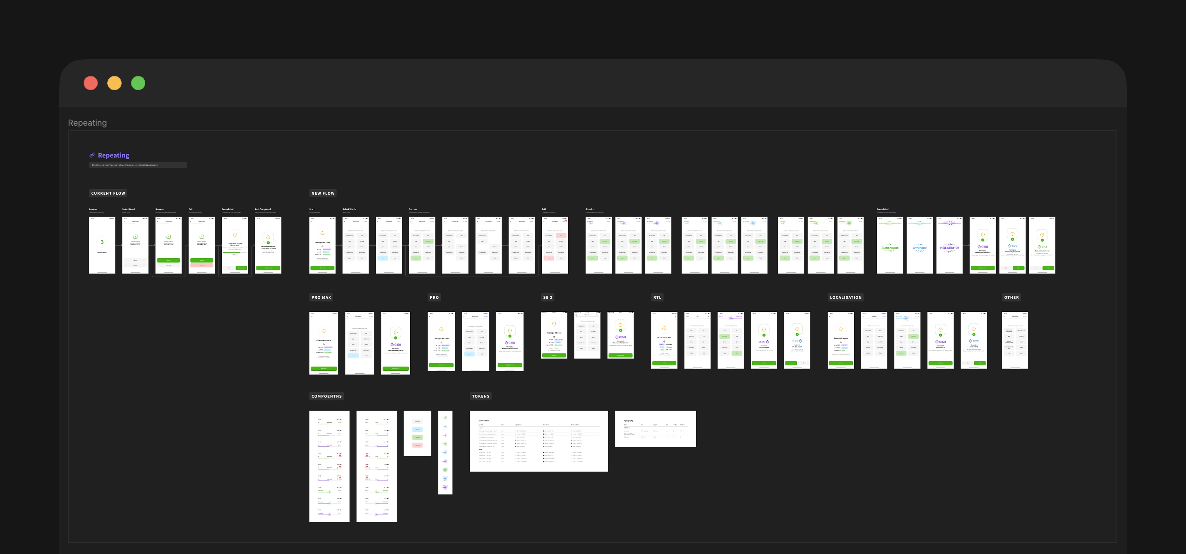
What We Tested
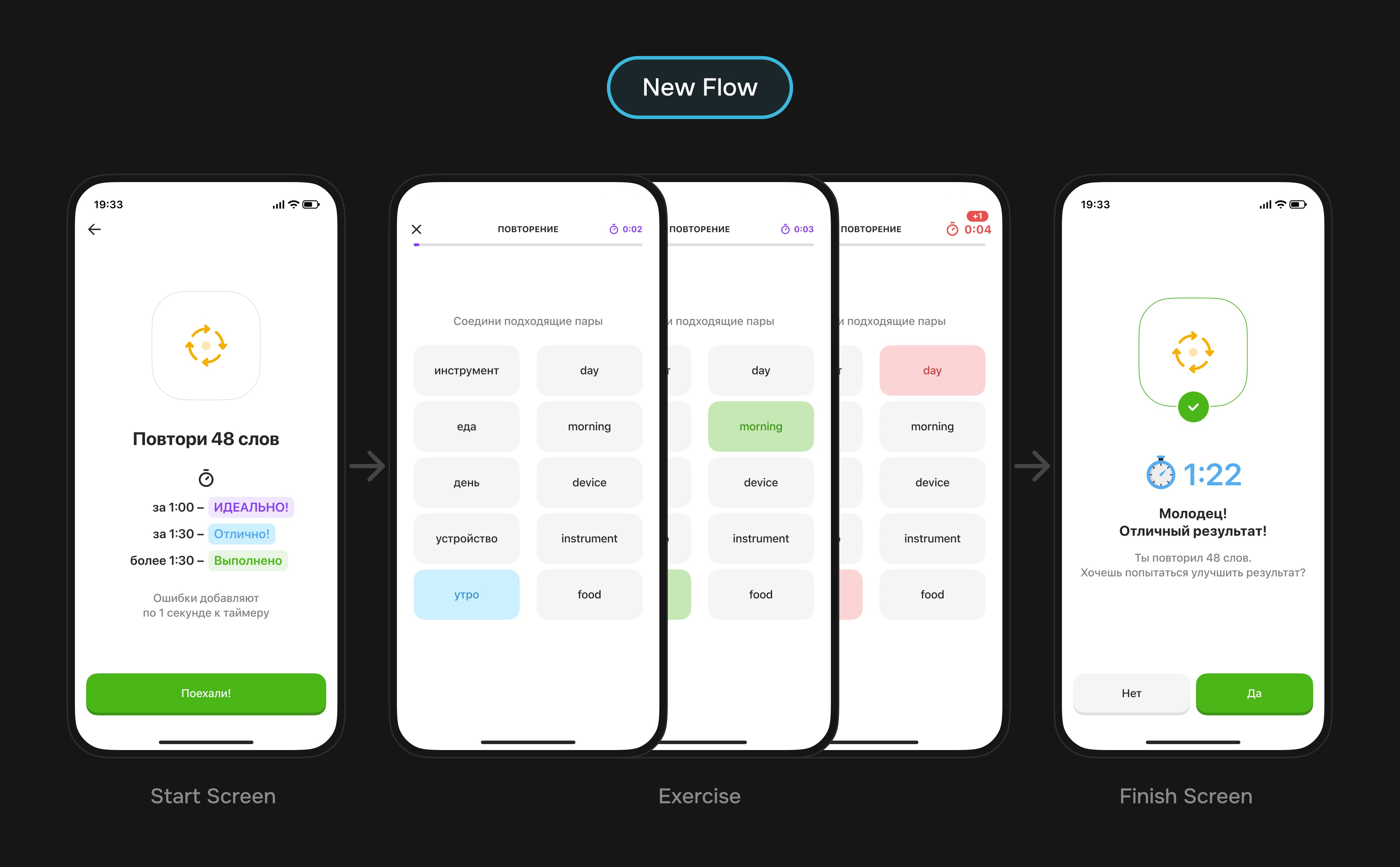
We tested it in one pass: old direct flow versus a new matching mechanic. The new scenario added pairs, a timer, mistakes, result grading, and retry.
| Version | What Changed | Risk |
|---|---|---|
| Old flow | One word at a time, clear validation, simple completion | Can feel boring with a large word set |
| New flow | Matching pairs, timer, mistakes add time, graded result | More cognitive load and less calm focus on the word |
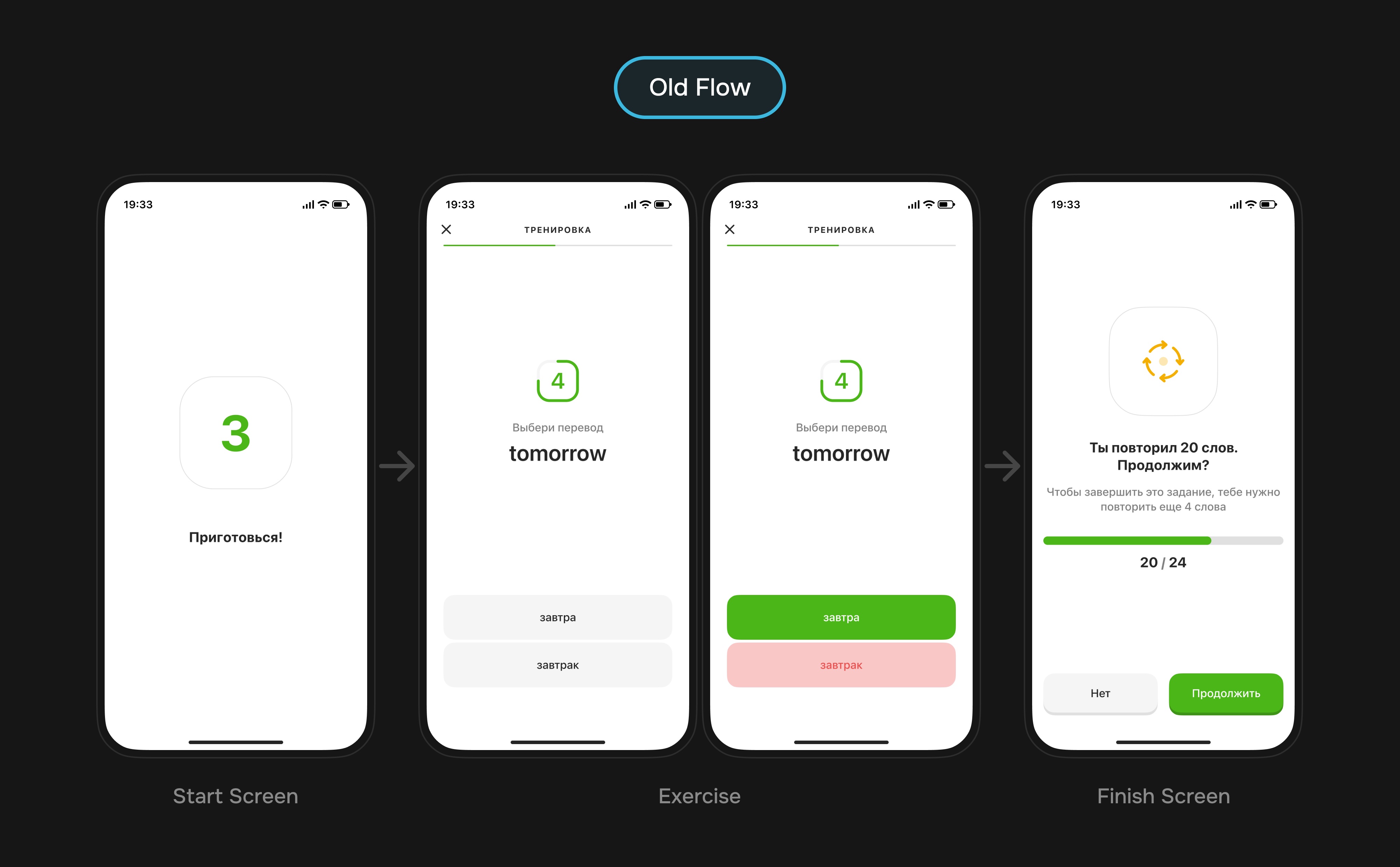
Why It Did Not Work
The new flow looked more active, but became heavier: users watched the timer, searched for pairs, remembered mistake rules, and repeated words at the same time.
- The timer added pressure where a calmer repetition mode was needed.
- Matching tested search speed almost as much as word knowledge.
- The flow required more states and rules, but did not create enough clear value.
- 48.9% of cancellations happened on the preview: users saw pairs, the timer, and the mistake penalty before starting, then left the workout.
Takeaway: not every more interactive solution makes learning better. Sometimes the older, calmer scenario solves the user's task more precisely.
Diagnostics pointed to cognitive overload: median duration grew by 247%, error conversion increased by 127%, and almost half of cancellations happened before the first in‑workout action.
Outcome as a Learning
This version was not worth developing further. It helped separate useful motivational layers from changes that break workout clarity.
Main takeaway: word repetition should be improved through small feedback layers, not a full scenario replacement.